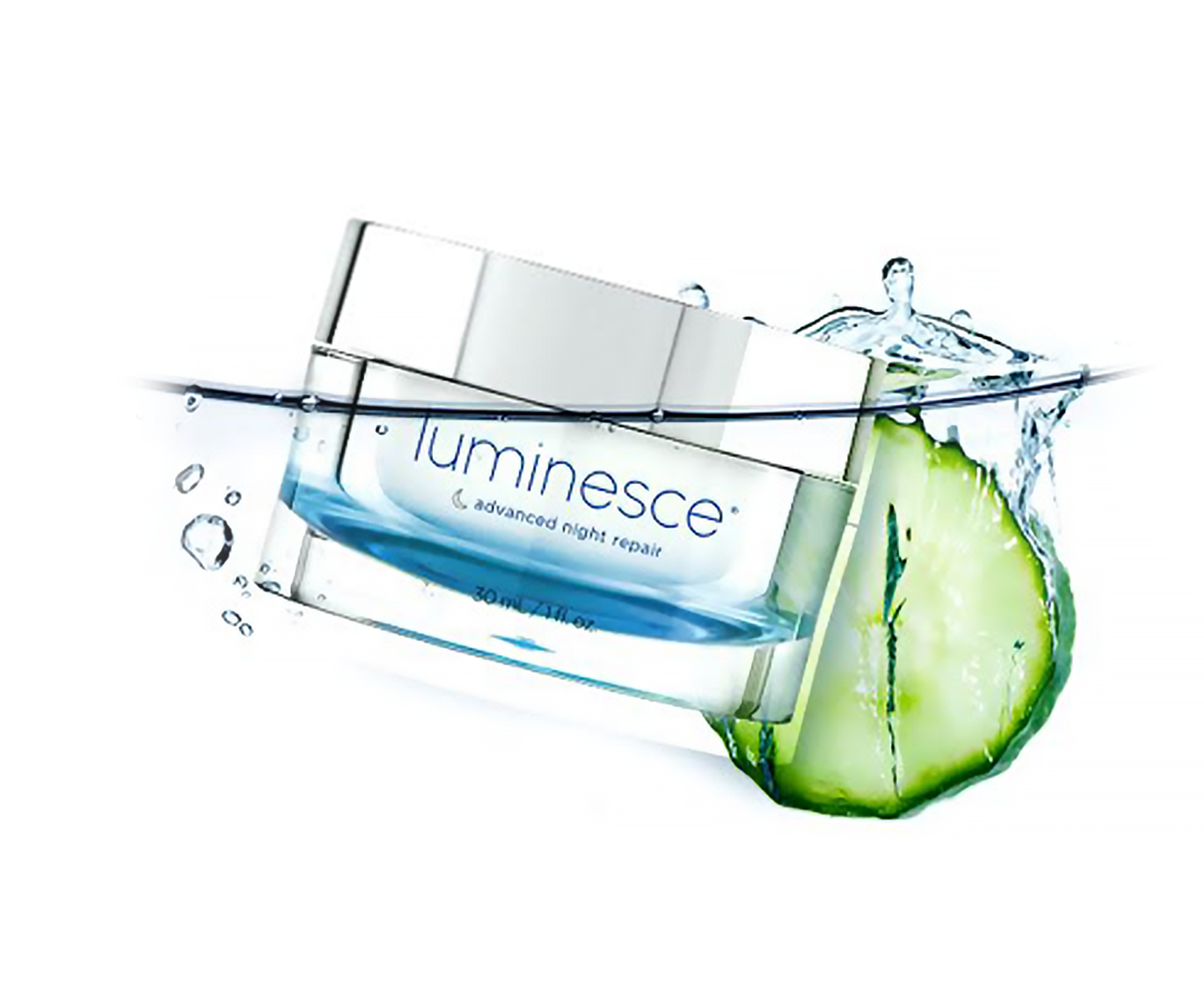
Luminesce
With strict limits on packaging options and production time the challenge for our small team was to rebrand an existing product that stands out among it's competitors and speaks to a more focused, youthful, and healthy demographic without offending loyal, long term customers – maintaining and enhancing the dialogue between the business and their patrons.
Copy Writer Victoria Sanchez, Senior Designer Jennessa Barrios, Photo Editing Quistina Hullon

Starting with the logo this project was a total overhaul.
After much conversation, research, trial and error, for the Luminesce logo we landed on a version of Helvetica. Thinly weighted, feeling light and wispy, lower case letters bringing some youthfulness to the chic, this wordmark expresses an effortless elegance.

The vision for the packaging was to create a fresh, sophisticated, spa-like experience at home.
By using calming yet invigorating blues, soft washes of color, negative space, rethinking the possibilities of the packaging options coupled with a modern layout, this collection communicates a refined more balanced message of "Redefining Youth."

Because the company is international it was important that the focus audience needed to represent multi-culture as well as multi-lingual groups. I created a set of icons to help distinguish the product.

In addition to the product itself I contributed to digital and print marketing material ie Social Media, Eblasts, Live Event Media and Promo; All which helped continue to translate the message of the brand across multiple channels.
_
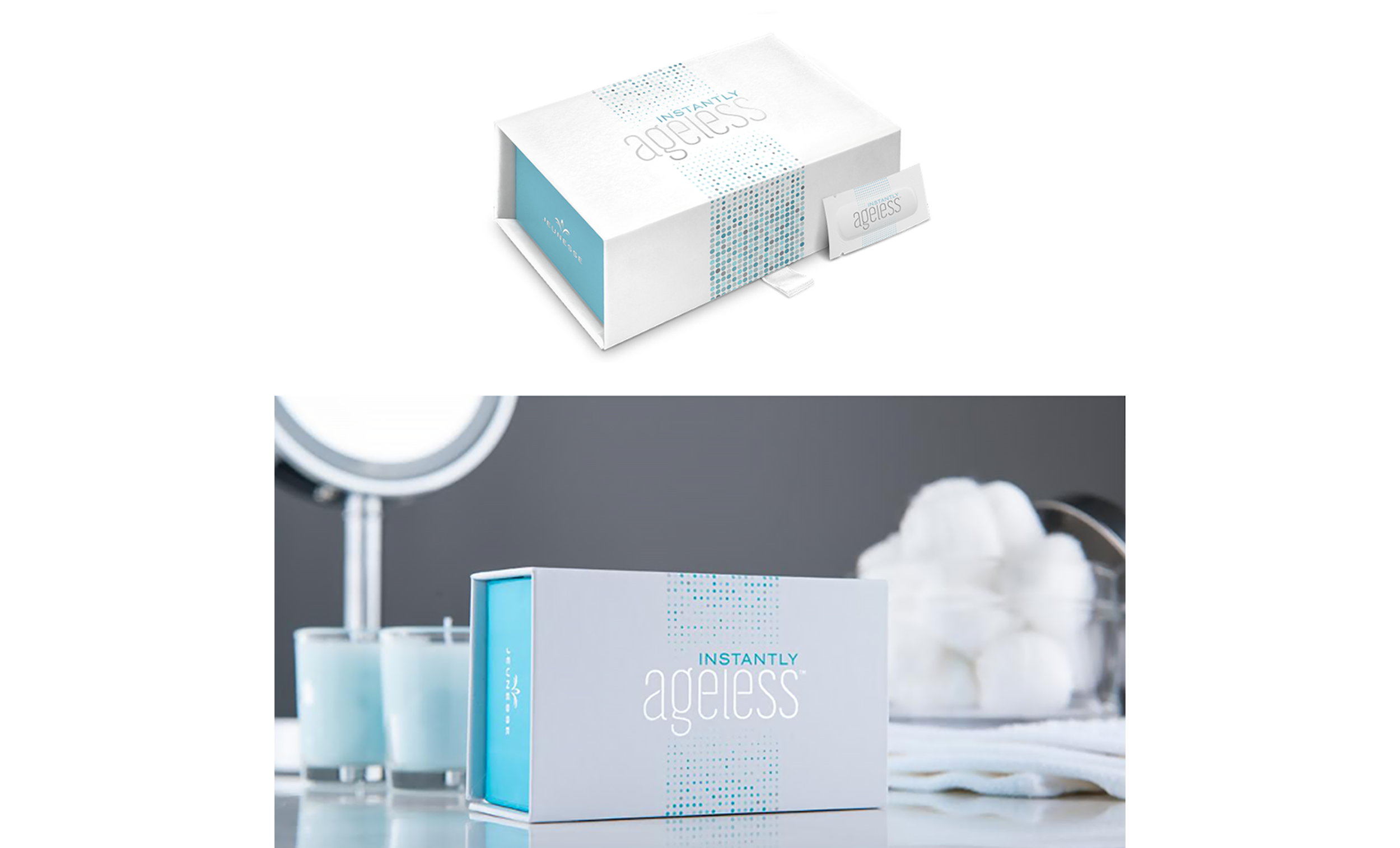
Instantly Ageless

In addition to Luminesce, this quick turn around project came up during development. The product itself smoothes and removes unwanted fine lines, spots, and wrinkles. A half-tone pattern was created to communicate the act of diminishing. While the overall packaging was meant to feel luxurious and flawless using a matte finish with UV coating and spot color as well as a satin pull tab and magnetic seal, with the logo representing a broad demographic.

E-blasts were part of the everyday, like a Shutterstock librarian I would hunt through stock photos for a well lit, believable, unique image with the goal and complete focus to catch attention and direct traffic to the company website or to inform about upcoming events. I would then reset the translated design into over 16 different languages.
