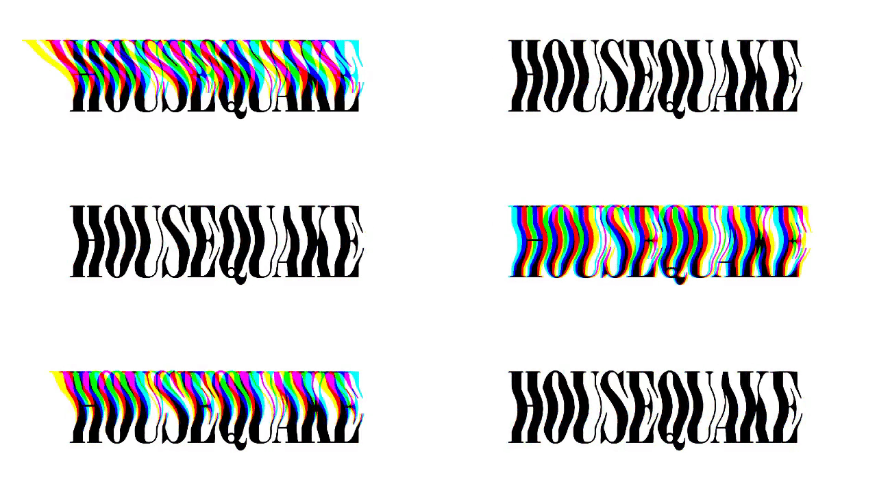
Housequake
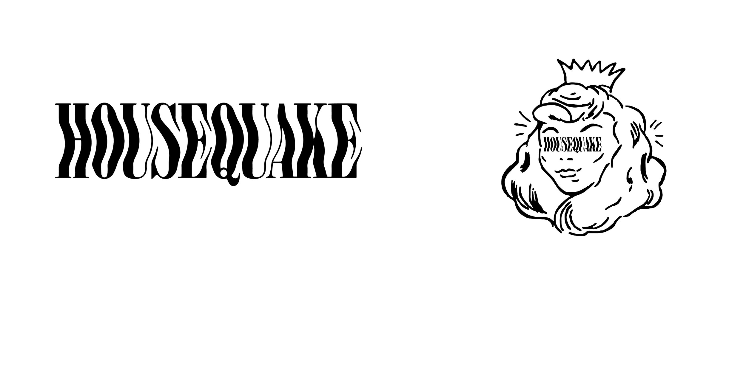
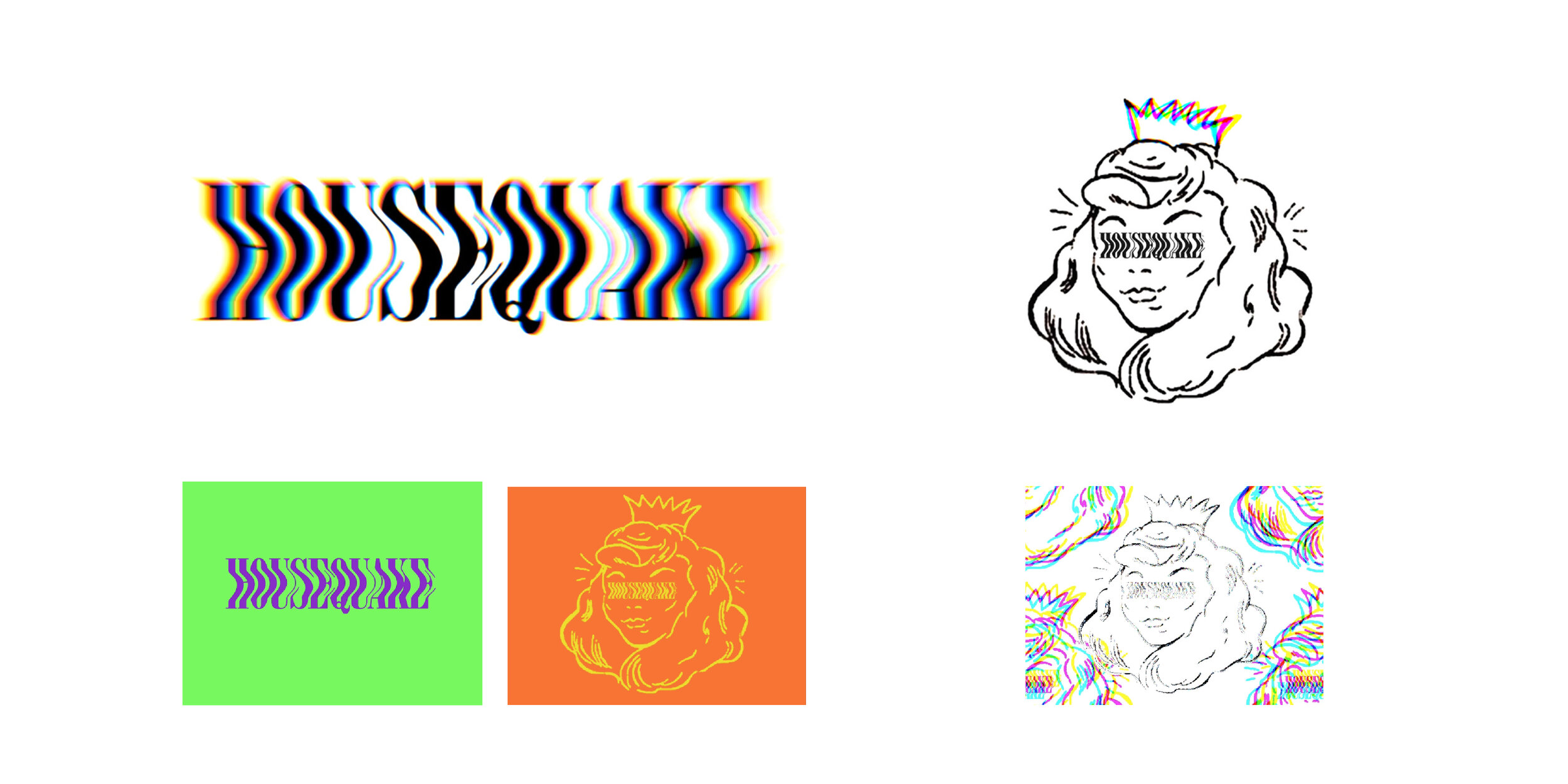
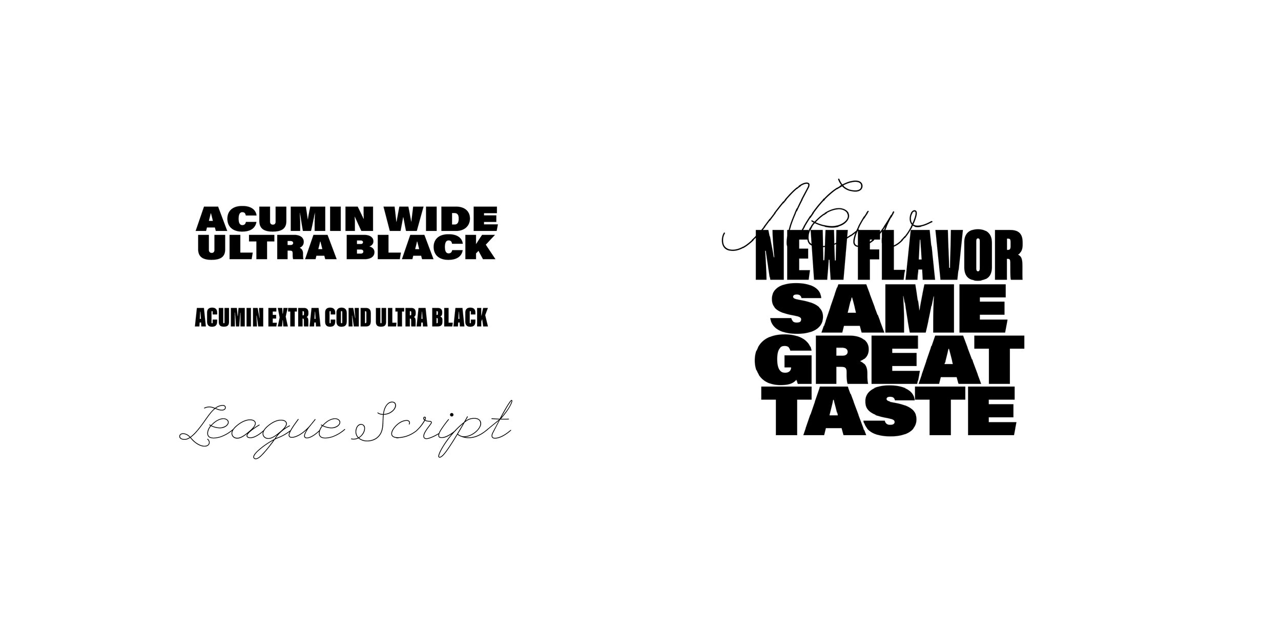
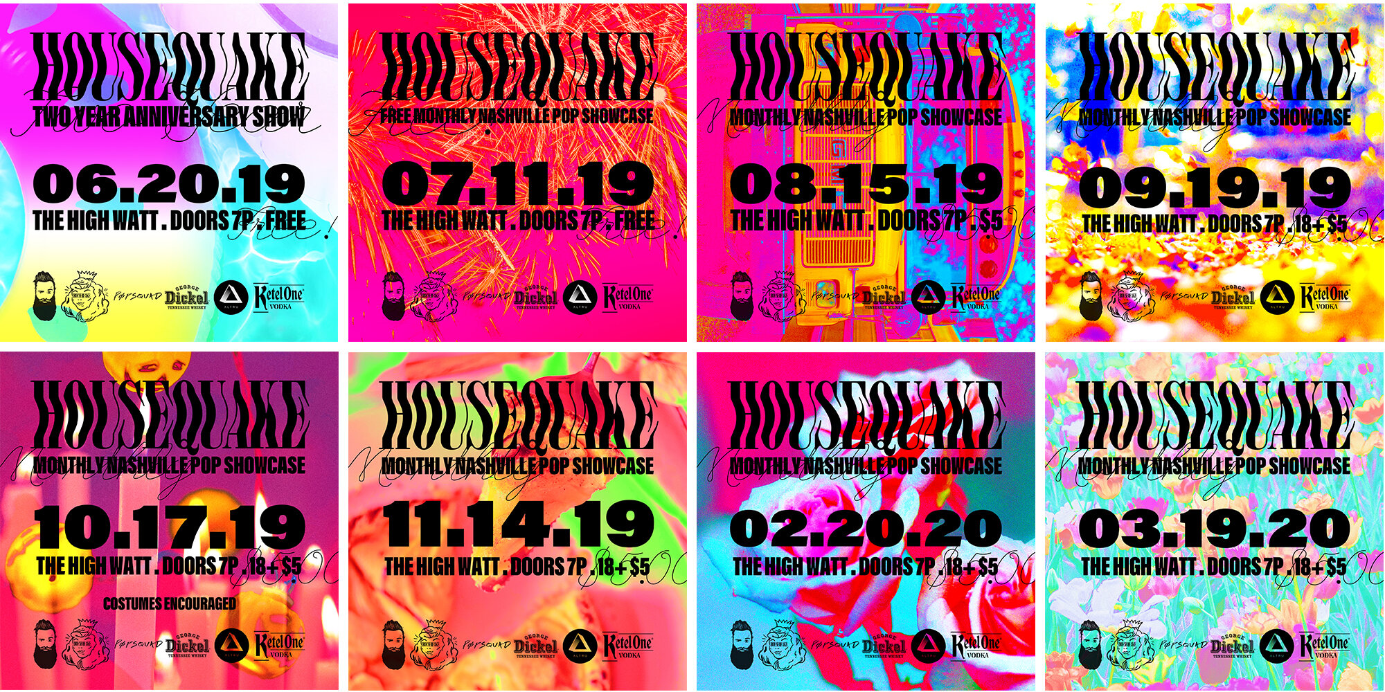
How do you make a logo dance? Put a lil boogie in it. A monthly pop music showcase in Nashville, Tn. Inspired by movement, the branding for HQ is bold, energetic, and adaptive in order to quickly relay information to a fast moving audience. The princess was previously being used and needed to remain in some way. In order to integrate and connect as well as communicate illusion and mystery I used the wordmark in place of the princess’ eyes. Additionally, I created a template 1:1, poster, and mock-up, to streamline reoccurring shows with updated headlines. Each month I create a colored background based on a monthly theme. The colors for Housequake come from 2 places: It’s own movement and distortion as well as the environment in which It lives. Script accents highlight a heavy weighted sans serif for character and energy.
